Your menu is one of the first things visitors see when they go to your website, so you want it to have some style right? Of course you do! That’s why in today’s post I’m going to share three ways to add some nice hover effects to your menu with custom CSS.
Hover effects should be subtle, we want visual interest but that’s not the most important part of the site, your content is. These will add just the right amount of “pop” to your Divi navigation.
Not only will we be adding a nice hover effect but there will also be some style applied to the link of the active page. For instance, if the user is on the homepage, then the home link in the menu will have some sort of small design treatment applied. This is a common visual marker to include on websites to help remind the user where they are on the site. It’s not absolutely necessary, but it’s a nice bit of helpful UX.
Let’s get started!
3 Beautiful CSS Hover Effects You Can Add to Your Divi Menus
Theme Customizer Settings
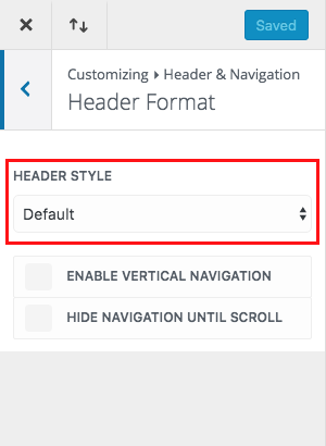
First off, for all the styles we’re going to be using the default settings for header format. If you’ve just installed Divi you don’t need to configure this setting, it should be set to this automatically.

Style One – Growing line underneath
In this menu style we’ll be adding a line that appears to grow from left to right directly beneath the menu item being hovered over. It will also set a static line directly beneath the active page link.

Inspiration
This is a really nice effect that can work well on pretty much any kind of site, plus editing the code for this style to change the color and line width is pretty easy for any level user. It’s a pretty popular hover effect that I’ve seen on sites for years. I think it’s subtlety is what makes it so versatile, it can be used on a real estate site as well as a musician’s site and everything in-between.
Implementation
Add the following code to your child stylesheet OR to Divi theme options > general > custom CSS box:
#top-menu .current-menu-item a::before,
#top-menu .current_page_item a::before {
content: “”;
position: absolute;
z-index: 2;
left: 0;
right: 0;
}
#top-menu li a:before {
content: “”;
position: absolute;
z-index: -2;
left: 0;
right: 100%;
bottom: 50%;
background: #15bf86; /*** COLOR OF THE LINE ***/
height: 3px; /*** THICKNESS OF THE LINE ***/
-webkit-transition-property: right;
transition-property: right;
-webkit-transition-duration: 0.3s;
transition-duration: 0.3s;
-webkit-transition-timing-function: ease-out;
transition-timing-function: ease-out;
}
#top-menu li a:hover {
opacity: 1 !important;
}
#top-menu li a:hover:before {
right: 0;
}
#top-menu li li a:before {
bottom: 10%;
}
Style Two – Thick “boxy” look with line underneath
In this menu style we’ll be placing a large “blocky” line that animates down from the menu section beneath the menu item the mouse is hovering over. It also places a chunky box over the active menu link.

Inspiration
I use this style myself on a Divi child theme I developed called Executive (I’ll link to the demo below so you can see the hover in action on a real site). Visually this is not as subtle as the first style, I think picking the right site to use it on would be key. It’s important to match any type of small design detail like a hover effect to the overall feel of the site.
Implementation
Add the code below to your child theme’s stylesheet or to Divi’s custom css box under the Theme Options general tab. As far as ease of editing the color is very easy to change, but if you plan to change the width of the border you’ll find you’ll need to play with the other numbers in the CSS as well.
#top-menu li > a:hover {
box-shadow: 0 10px 0 0 #F15A29 !important; /*** COLOR AND THICKNESS OF THE LINE ON HOVER ***/
padding-bottom: 34px;
opacity: 1 !important;
}
#top-menu li li a {
padding-bottom: 6px !important;
}
#top-menu li.current-menu-item > a,
.et-fixed-header #top-menu li.current-menu-item > a {
border: 10px solid #F15A29; /*** COLOR AND THICKNESS OF THE BOX ***/
padding: 10px;
margin-bottom: -10px;
}
Style Three – Background colored buttons
This menu style turns the menu items into buttons with coordinated hover colors. It also gives another, separate color, to the active menu link.

Inspiration
This is inspired by buttons of course 
Implementation
As with the other two styles above, you’ll want to add the custom css code below to your child theme’s stylesheet or to the custom css box in Divi’s general theme settings tab. You can make your own tweaks and changes to the code (such as colors) by adjusting values next to the commented portions of the code.
.et_header_style_left #et-top-navigation nav > ul > li > a,
.et_header_style_left .et-fixed-header #et-top-navigation nav > ul > li > a {
padding-bottom: 15px;
}
#top-menu li {
padding-right: 5px;
}
#et-top-navigation {
padding: 20px 0 !important;
}
#top-menu li a {
background: #C1B2AB; /*** CHANGES THE BACKGROUND COLOR ***/
padding: 15px 20px;
border-radius: 3px;
}
#top-menu li a:hover,
#top-menu li li a:hover {
color: #fff !important;
}
#top-menu li a:hover {
background: #559CAD !important; /*** CHANGES THE BACKGROUND COLOR ON HOVER ***/
}
#top-menu li.current-menu-item > a {
background: #edc77b; /*** CHANGES THE BACKGROUND COLOR OF THE CURRENT PAGE LINK ***/
}
#top-menu .menu-item-has-children > a:first-child:after {
content: none;
}
Examples of These Styles on Divi Sites “In the Wild”
Here are some examples of these styles (or very similar) being used on live Divi websites.
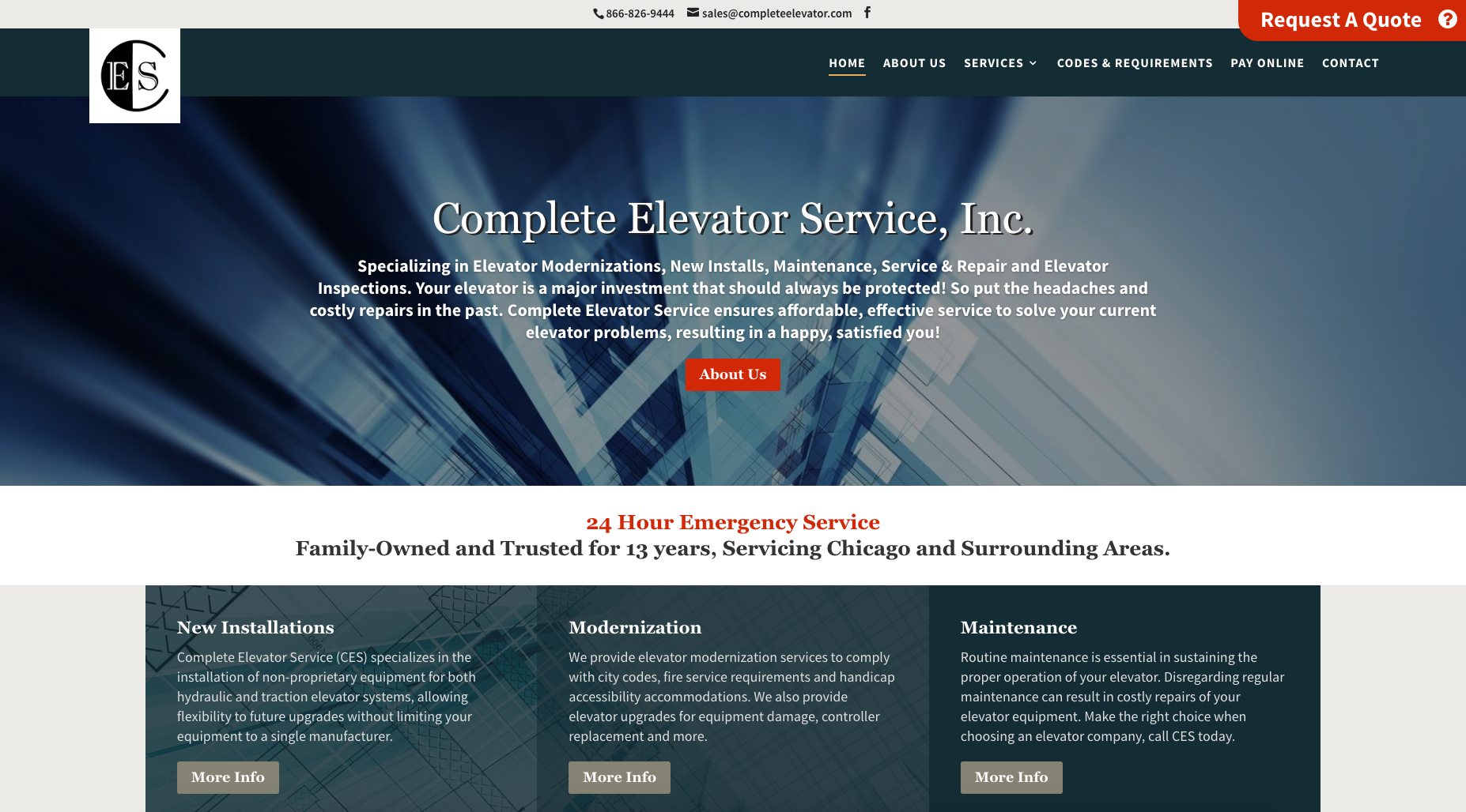
Complete Elevator Service

This site has the thin line treatment being used elsewhere on headings, so the hover style is being tied into the overall look so that it makes sense.
View the Complete Elevator Service Site
The Executive Premium Divi Child Theme

Like in the example above the style of the thick line is being used elsewhere on the site so that the different design elements complement each other.
View the Executive Premium Divi Child Theme
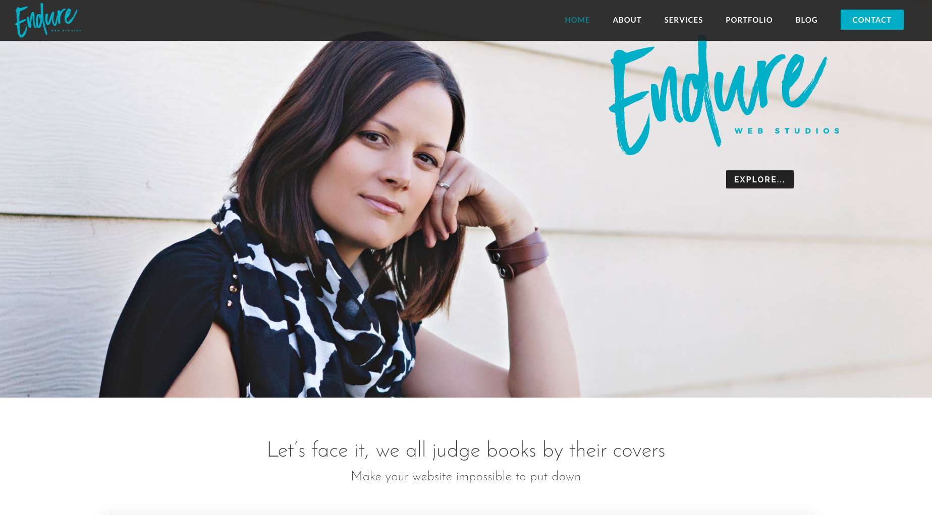
Endure Web Studios

Source: https://www.elegantthemes.com/blog/divi-resources/beautiful-css-hover-effects-you-can-add-to-your-divi-menus

